Analytics
- In the Analytics section, you can add custom dashboards by clicking the Settings button in the top-right corner. If you haven’t added any dashboards, a default dashboard with pre-configured widgets will be displayed.
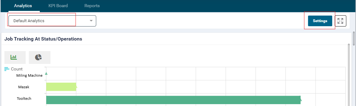
- The Analytics section provides insights into job progress, machine utilization, major cost centers, top-earning clients, and opportunities for continuous improvement.
- Use the Expand/Collapse button in the top-right corner to resize the widgets on your dashboard.
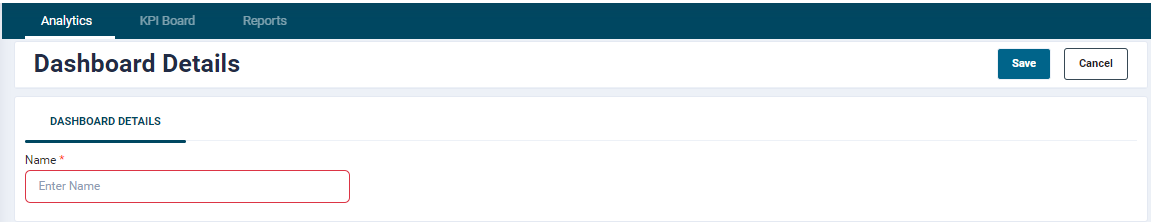
- Click the Settings button to add a new dashboard by selecting the Add Dashboard option.
- When adding a dashboard, you can name it to suit your specific needs.

- Clicking on Add Dashboard will allow the user to enter Dashboard name
-
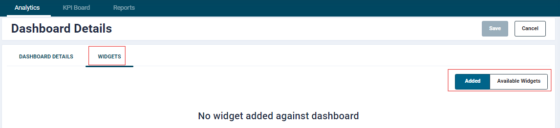
Available Widgets tab will show following widgets:
- Job Tracking At Status/Operations
- Machine Utilisation
- File View
- Production Throughput
- Capacity Dashboard
- Operator Utilisation
- Actions
- Schedule Tracking
- Operational Losses
- Top Clients
- Production Output (Planned vs Actual)
- Estimated Vs Actual Summary
- Estimated Vs Actual
- KPI Board
Widgets
Job Tracking at status/Operations
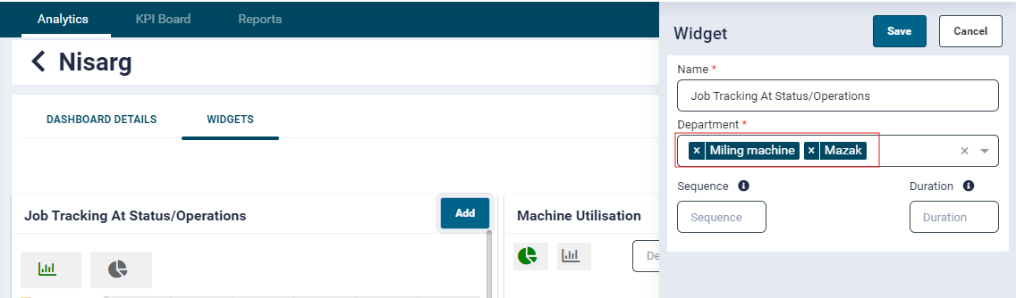
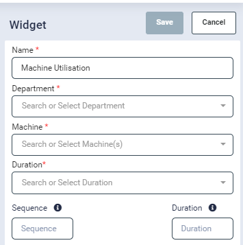
- Clicking the Add button on this widget opens the configuration panel.
- The configuration includes the following fields:
- Name (mandatory; pre-filled by default)
- Department (mandatory)
- Sequence
- Duration
- Complete the mandatory fields to proceed with setting up the widget.
![]()
- While configuring the widget, users can select multiple departments. Once saved, the widget will display data based on the selected departments.
- This widget will show the job code having Operation in progress, paused or completed having department with high priority.
Note : Only job codes that have not yet been dispatched will appear when hovering over the bars corresponding to each department.
![]()
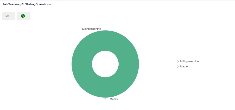
- User will able to view the data of widget in graph or pie chart.
- By default, the data is displayed as a graph.
- To switch to a pie chart, click the corresponding toggle button

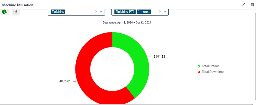
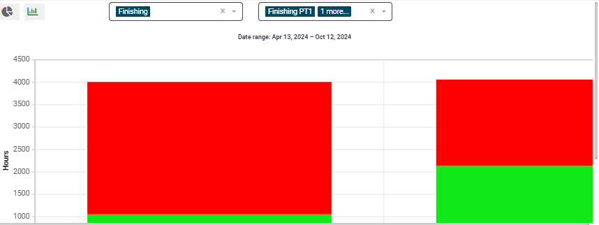
Machine Utilisation
- A Machine Utilisation Chart provides a detailed analysis of a machine's performance over a specific period, highlighting its uptime (productive operational hours) and downtime (non-operational hours). This chart is essential for monitoring efficiency, identifying issues, and optimising resource use.
Data Displayed:
Uptime:
- Total time the machine was actively operational and performing tasks.
- Total number of uptime hours to the total available hours.
Downtime:
- Total time the machine was idle, undergoing maintenance, or unavailable for tasks.
- Reasons for downtime, such as breakdowns, scheduled maintenance, or lack of work orders.
-
Total number of downtime hours relative to total working hours.
-
Clicking the Add button on this widget opens a configuration popup. The following fields are included:
- Name (mandatory; pre-filled by default)
- Machine (mandatory)
- Department (mandatory; multiple departments can be selected)
- Duration (mandatory)
- Sequence
- You can also select multiple Departments and Workcenters during configuration.
- Once all mandatory fields are completed and saved, the widget will display data on total machine utilization and downtime for the specified machine and duration.
-
Users can view the data in either pie chart or a graph.
- By default, the data appears as a pie chart.
- click the toggle button to switch to the graph view

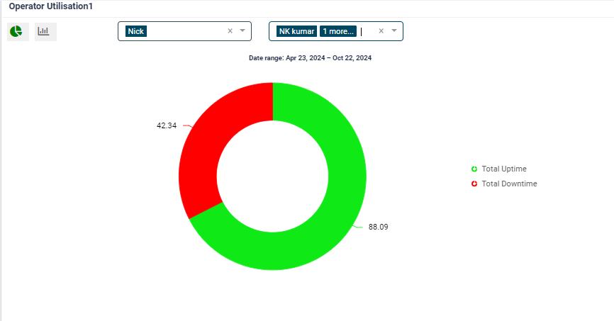
Operator utilisation
- An Operator Utilization Chart provides a comprehensive overview of an operator's performance during a specific period. It visually represents the operator's uptime (productive hours) and downtime (non-productive hours) to help identify patterns and areas for improvement.
Data Displayed:
Uptime:
- Total productive time spent actively operating a machine or performing tasks.
- Total number of uptime hours relative to the total working hours.
Downtime:
- Total time the operator was idle, waiting for tasks, or involved in non-productive activities.
- Reasons for downtime (e.g., machine maintenance, lack of materials, or task delays).
- Total number of downtime hours relative to total working hours
Clicking the Add button on this widget opens a configuration popup. The following fields are included:
- Name (mandatory)
- Department (mandatory; multiple departments can be selected)
- Operator (mandatory)
- Duration (mandatory)
- Sequence
- Workcentres (multiple selections allowed)
Once configured, the widget displays the selected operator's utilization on the machine.
Data is presented by default in a pie chart view.
- To switch to a graph view, click the toggle button
 .
.
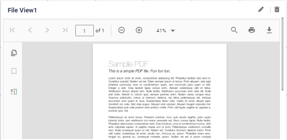
File View
The File View dashboard can be used on the factory floor as a centralised platform for displaying important documents, such as safety messages and business values, in an easily accessible format for users/operators. This dashboard allows businesses to display key messaging to the factory floor on a rotational basis.
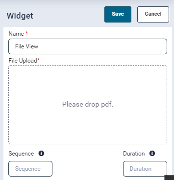
- Clicking the Add button on this widget opens the configuration popup, where the following fields are included:
- Name (mandatory; pre-filled by default)
- File Upload (mandatory; accepts only PDF files)
- Sequence
- Duration
- During configuration, the Name field will be pre-filled, and the File Upload box will only accept PDF files for upload.
- Once configured, the widget will display the uploaded PDF file within the widget itself.
- This widget will show the pdf file in the widget which is uploaded while configuration.
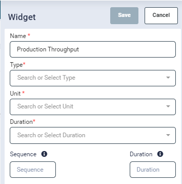
Production Thoughput
The Production Throughput Dashboard enables users to track and compare production output in real-time, offering insights into performance at the workcenter, department, or category level. By displaying output either in duration or components, this dashboard allows users to tailor the data to their specific needs and compare current performance with historic values for trend analysis. This dashboard provides users with a powerful tool to monitor production efficiency, identify trends, and make informed decisions to optimise operations.
- Clicking the Add button on this widget opens the configuration popup, where the following fields are included:
- Name (mandatory)
- Type (mandatory)
- Unit (mandatory)
- Duration (mandatory)
- Sequence
- Duration (Rotational)
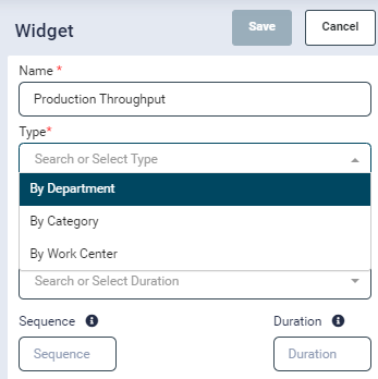
- The Type field can be configured to display data:
- By Department
- By Category
- By Workcentres
- Depending on the Type selection, the widget will show a list of active departments/categories/WorkCentre’s in a new field.
- The Unit field can also be configured to display either Duration or Components.
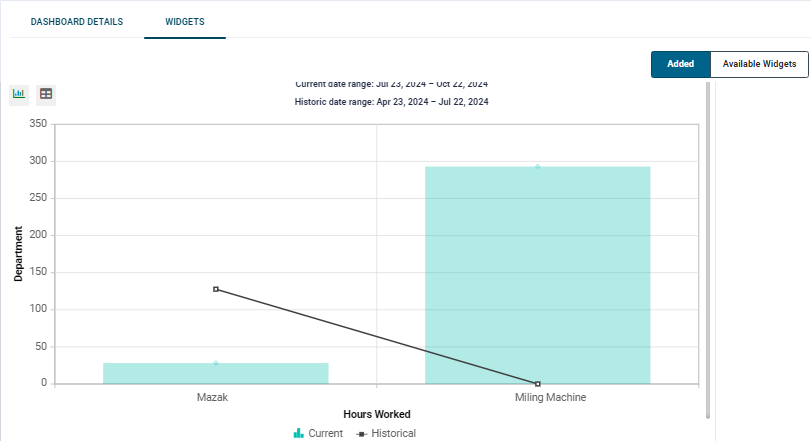
The widget’s data can be viewed in either a graphical or tabular format:
- By default, the data is displayed in graphical view.
- To switch to the tabular view, simply click the toggle button

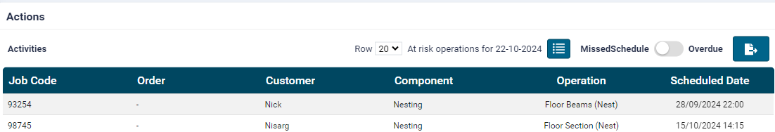
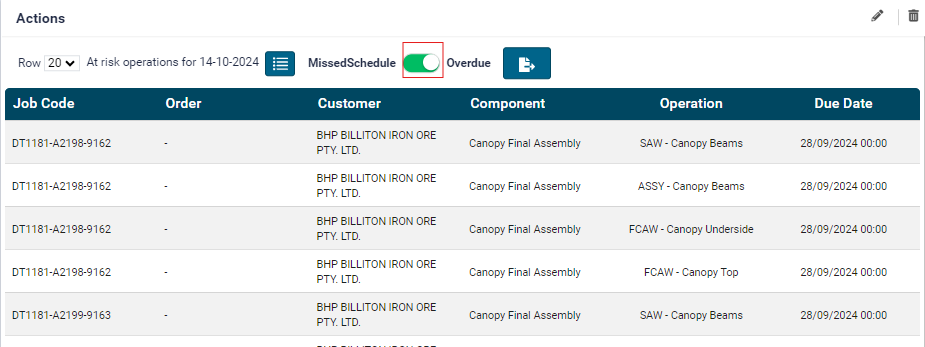
Actions
- Clicking the Add button on this widget opens the configuration popup, which includes the following fields:
- Name (mandatory)
- Department (mandatory; multiple departments can be selected)
- Sequence
- Duration
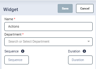
- Once configured, this widget displays a tabular view of missed schedules and overdue components, along with their relevant details.
-
By enabling the Missed Schedule switch, the widget will specifically show missed scheduled jobs and their corresponding details.
-
This widget allows users to easily track and manage any missed or overdue tasks, helping ensure timely completion of jobs and better resource planning
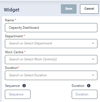
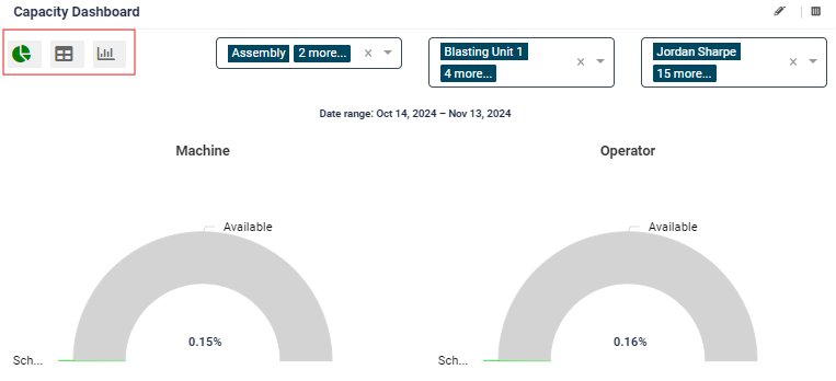
Capacity dashboard
This dashboard provides a comprehensive view of workcentre and operator capacity, allowing users to easily monitor and compare available versus scheduled work to optimize operations and resource planning.
- Clicking the Add button on this widget opens the configuration popup, which includes the following fields:
- Name (mandatory)
- Department (mandatory; multiple departments can be selected)
- Workcentre (mandatory; multiple workcentres can be selected)
- Duration (mandatory)
- Sequence
- This widget is designed to display the capacity and scheduled work of workcenters and operators within the given duration.
- The chart will show both available and scheduled hours for each workcentre and operator, which can be viewed by hovering over the chart elements.
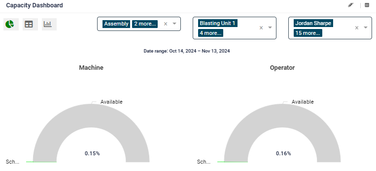
- By default, the data will be displayed in chart view.
- To switch to a graphical view, click the toggle button
- To view the data in a table format, click the corresponding toggle
- To switch to a graphical view, click the toggle button
Schedule Tracking
-
The Schedule Tracking widget provides a clear overview of ongoing tasks and their due dates, helping users stay on top of job progress and meet deadlines efficiently. This widget uses a planned schedule as the due by date for operations, giving targets for the factory floor to meet and follow.
- Clicking the Add button on this widget opens the configuration popup, which includes the following fields:
- Name (mandatory)
- Job Template (mandatory; multiple job templates can be selected)
- Department
- Operation
- Duration
- Sequence
- Clicking the Add button on this widget opens the configuration popup, which includes the following fields:
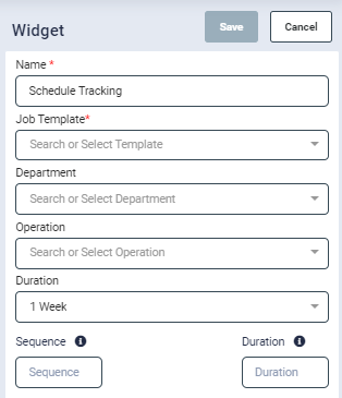
- Based on the Job Template selection, the widget will automatically display the corresponding Department and Operation options in their respective fields.
- This widget tracks the running operations for each job and displays the due date for the selected duration.
![]()
Operational Losses
It provides an overview of the most significant losses in operations, helping users identify areas for improvement and optimize performance.
-
Clicking the Add button on this widget opens the configuration popup, which includes the following mandatory fields:
- Name
- Department
- Month
-
This dashboard highlights the top operational losses captured from the factory floor during the selected month.
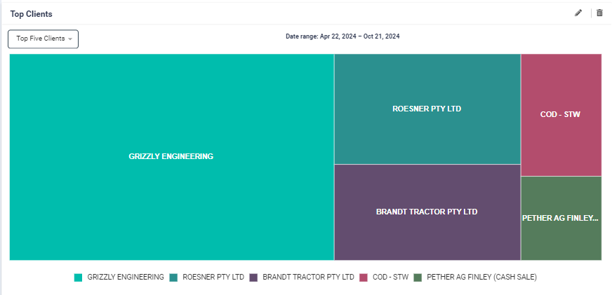
Top Clients
This widget helps users quickly identify key clients and assess the volume of work associated with them during a specific period.
- The Top Clients widget calculates the highest number of jobs performed for each client within the selected month.
- It displays the top 6 clients for whom the most jobs were completed, providing valuable insights into client engagement and workload distribution
Production Output (Planned vs Actual)
It provides valuable insights into production performance, helping users track and assess how well actual output aligns with planned schedules, and identify areas for optimization.
- Clicking the Add button on this widget opens the configuration popup, which includes the following mandatory fields:
- Name
- Department
- Month
- This dashboard highlights the production output of the selected department(s) by comparing scheduled vs. actual operations completed on a daily basis throughout the selected month.
Estimated Vs Actual
This dashboard highlights jobs/components where the actual duration exceeds the estimated duration, helping production managers track jobs that exceed expectations.
By monitoring these jobs, production managers can take timely action to address delays and improve planning accuracy, ensuring better resource allocation and on-time project completion.
- Clicking the Add button on this widget opens the configuration popup, which includes the following field:
- Duration (options include 1 day, 1 week, 1 fortnight, 1 month, 3 months, 6 months, or a custom date range)
- There is a toggle that enables users to select Job or Component view on the information presented. The Component view will highlight specific operations that had increased Actual duration to the Estimate where the Job view will highlight the entire job duration
Estimated Vs Actual Summary
This dashboard serves as a valuable tool for tracking and addressing performance gaps, allowing teams to focus on the most impactful deviations and improve overall efficiency.
- Clicking the Add button on this widget opens the configuration popup, which includes the following field:
- Duration (options include 1 day, 1 week, 1 fortnight, 1 month, 3 months, 6 months, or a custom date range)
- This dashboard provides a summary-level view of deviations for the following data categories:
- Department
- Operation
- Client
- Job Template
- Category
- Machine
- Operator
- It presents the top 5, 10, or 15 deviations in terms of Estimated vs. Actual performance, helping managers quickly identify significant discrepancies in various areas of production.
KPI Board
This dashboard provides a clear visual representation of how well performance aligns with set goals, enabling quick identification of underperformance and areas requiring attention.
-
Clicking the Add button on this widget opens the configuration popup, which includes the following fields:
- Type (options include By Department, By Category, By WorkCentre, By Operator)
- If By Department is selected, a drop-down for Department selection appears.
- If By Category is selected, a drop-down for Category selection appears, and similarly for WorkCentre and Operator.
- Duration (options include 1 day, 1 week, 1 fortnight, 1 month, 3 months, 6 months, or a custom date range)
- Type (options include By Department, By Category, By WorkCentre, By Operator)
-
This dashboard allows users to set KPI goals for specific durations (1 day, 1 week, or 1 month) in two key areas:
- Hours worked
- Number of components completed
- Users can set these goals at the following levels: Operator, WorkCentre, Department, or Category.
- The dashboard tracks actual performance against the goals, displaying the following indicators:
- Green if the actual performance exceeds the goal.
- Red if the actual performance is less than the goal.